[android] Nice 한 UI 를 만드는 규칙~
https://medium.com/@erikdkennedy/7-rules-for-creating-gorgeous-ui-part-1-559d4e805cda
![adobe color cc, Beautiful google web fonts, black, Black and White First, Blur, Bold, Bottom, Box, Button, capitalization, Cards, cartoony, Checkboxes, Clean, COLOR, Double your whitespace, down pop, dribble, dropdown controls, entypo social, flashy, Flat, flat design, flatty, font weight, FontSquirrel, gray 변형, grayscale, icon font, IMAGE, inset, italicization, Learn the methods of overlaying text on images, letter spacing, Light, Light Comes From the Sky, light 규칙, lowering, Make text pop and un-pop, margin, nice 한 ui, outset, Overlay, popup, pressed button, radio button, raising, scrim, selected radio button, Shadow, Simple, Size, slider buttons, slider tracks, slight animation, Sporty, strikethrough, text, text bg color, text input field, thin, thumbnail, Top, Typekit, underline, unpressed button, unpushed button, up pop, Use Good Fonts, WHITE, [android] Nice 한 UI 를 만드는 규칙~, 무료 폰트, 무료 폰트 사이트, 바닥 blur, 바닥 fade, 배경, 심미, 완전한 black, 이미지, 이미지 blur, 채도, 흰 글씨](https://t1.daumcdn.net/cfile/tistory/2273013458F993930F)
1. Light comes from the sky
2. Black and white first
3. Double your whitespace
4. Learn the methods of overlaying text on images
5. Make text pop - and un-pop
6. Only use good fonts
7. Steal like an artiest
Light Comes From the Sky
-
빛이 하늘로부터 온다면, Top 부분이 반짝인다.
그리고 shadow 를 하단에 만든다.
Top 부분은 더 밝고, Bottom 쪽은 어둡다.
-
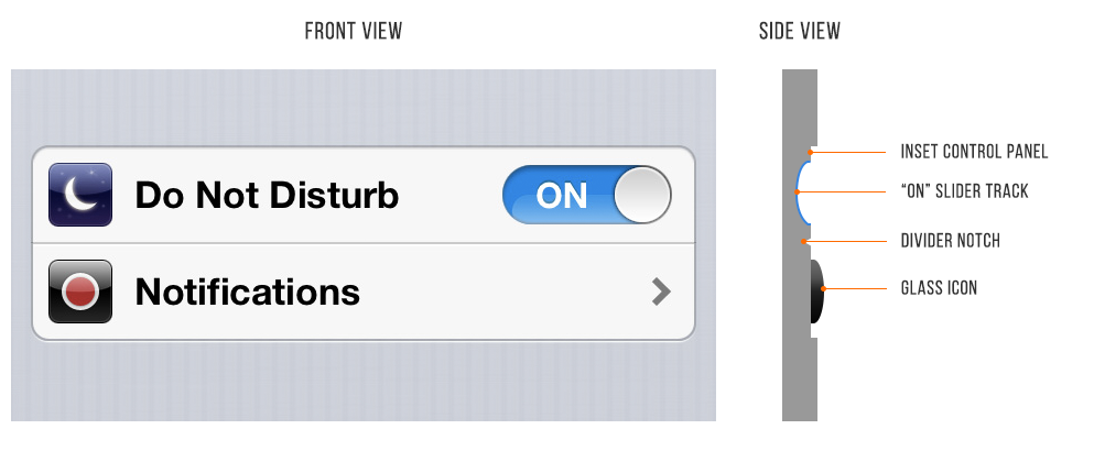
Button 하나에도 다음과 같은 light 규칙을 적용할 수 있다.
1. unpushed button - dark bottom edge
2. unpushed button - slightly brighter at the top
3. unpushed button - subtle shadow
4. pushed button - overall darker
-
일반적인 inset( 안쪽으로 파임 ) 은
text input field
pressed button
slider tracks
radio button ( unselected )
checkboxes
-
일반적인 outset( 바깥으로 튀어나옴 ) 은
unpressed button
slider buttons
dropdown controls
cards
selected radio button
popup
-
inset, outset, light 등이 flat desgin 에 반론되는 이야기라고는 하지만,
완전 flat 은 궁극적인 desgin trend 는 되지 않을 것으로 보인다.
material design 처럼 최소한의 개념, 느낌을 주는 flatty 여야지, 완전 flat 도 완전 3D 는 mobile 에서 답이 아닌 것 같다.
Black and White First
-
color 를 부여하는 것은 나중에 하고, black & white 로만 우선 생각해보자.
너무 많은 color 를 쓰는 것은 clean/simple 에 맞지 않다.
다시 말하자면 spacing, size, layout 이 먼저 선행되어야 한다는 것이다.
-
sporty, flashy, cartoony 등의 theme 에는 이 규칙은 예외다.
위의 경우는 extreme 하게 color 를 잘 써야 한다.
하지만 대부분의 앱은 clean & simple 을 지향한다.
-
사실 가장 추천되거나 좋은 방법은 grayscale 에 한가지 색상을 추가하여 effect 를 주는 것이다.
여기서 grayscale + two color or grayscale + 한 가지 채도의 multiple color 를 사용 등이 확장이 되겠다.
-
한 가지 혹은 두 가지 채도로 color 를 사용하는 것은 디자인을 망치지 않으면서 색을 넣을 수 있는 안정적인 방법이다.
-
완전한 Black 을 사용하지 말자.
실세계에서 완전한 black color 를 보는 일은 매우 드물다.
gray 색의 변형이 주로 많이 쓰인다.
-
Adobe Color CC 이나 Dribble 같은 도구와 사이트들을 잘 사용하자.
Double your whitespace
-
디자인된 느낌을 주려면 숨쉴 수 있는 공간을 많이 주어야 한다.
Learn the methods of overlaying text on images
-
방법 0 : 이미지 위에 그냥 글씨 쓰기
이미지 위에 바로 그냥 글씨를 쓰는 것은 배경에 많은 영향을 받기에 좋은 방법은 아니다.
-
방법 1 : 이미지 위에 overlay 씌우기
이 방법은 thumbnail 등의 작은 이미지에서는 잘 작동한다.
보통 검은색의 overlay 가 주로 쓰이며, 이 방법은 overlay 색만 바꾸면 되는 간단한 방법이다.
-
방법 2 : Text를 배경색이 있는 box 에 넣는다.
이 방법은 매우 간단하며 신뢰성이 있다.
그러나 심미적으로는 조금 안 이쁠 수는 있겠다.
-
방법 3 : 이미지 blur 시키기
생각보다 매우 modern 하며 글씨를 보여주기에도 좋다.
-
방법 4 : 바닥부분을 fade 시키고 그곳에 흰 글씨 쓰기
매우 괜찮은 방법.
보통 이미지의 중간이 0% 로 시작해서 바닥은 20% 정도의 opacity 를 갖는 검은 배경을 설정한다.
-
방법 5 : 방법 4 의 variation 같은 것으로.. 바닥부분을 blur 처리하기
이 녀석도 괜찮은 방법이다.
-
방법 6 : Scrim
Scrim 은 사진 장비의 하나로 "빛을 부드럽게" 만들어준다.
scrim 을 사용한 후 text 를 overlay 하면 가독성이 의외로 좋다.
Make text pop and un-pop
-
가장 어려운 것 중 하나가 text 를 멋지게 보이는 것이다.
-
text 에 가할 수 있는 option 들은 보통 다음과 같은 것들이 있다.
Size
Color
Font weight ( bolder, thinner )
Capitalization
Italicization
Letter spacing
Margin
Underline ( not recommended )
Text bg color ( not recommended )
Strikethrough ( not recommended )
-
Big, Bold, Capitalize, High contrast 된 글씨들은 눈에 잘 띈다. ( up pop )
반대로 Small, less contrast, less margin 글씨들은 눈에 잘 안 띈다. ( down pop )
-
제목은 up pop 으로 하고, 나머지는 up pop 과 down pop 의 mix 로 해야 한다.
-
Selected, Hovered style 은 다음 조건들을 조정하면 된다.
Text color
BG color
Shadow
Underline
Slight animations ( raising, lowering )
Use Good Fonts
-
가능한 simple clean 한 무료 font 를 쓸 수 있음 쓰자.
-
entypo social 이라는 icon font 들을 다시 만들지 말고 잘 구해다 쓰자.
-
Beautiful google web fonts, FontSquirrel, Typekit 등에서 무료 폰트를 구할 수 있다.
Steal like an artist
-
다음 사이트들에서 좋은 리소스들을 잘 따와서 쓰자.
Dribble : https://dribbble.com/
Flat UI Pinboard : https://www.pinterest.com/warmarc/flat-ui-design/
Pttrns : http://pttrns.com/
'프로그래밍 놀이터 > 안드로이드, Java' 카테고리의 다른 글
| [android] ListView scroll 할 때 Toolbar 감추기 (0) | 2017.08.05 |
|---|---|
| [android] design support library (0) | 2017.08.04 |
| [android] 추가된 유용한 annotations (2) | 2017.08.02 |
| [android] VSYNC 가 뭐하는 녀석인지 간단히 이야기하면? (0) | 2017.08.01 |
| [android] Annotation Processing 에 대한 이야기 (0) | 2017.07.31 |


댓글